Images grab a person’s attention instantly and emotionally. Chosen correctly, a striking image in a well-designed ad connects with a person in ways that words can’t. Ads that force readers to stop flipping the page, creates an impression that converts a window shopper into a paying client.
“Ads are meant to create action, a person remembers your horse, goes to your website to get more info, or calls for more info,” said Pam Nunes, a Wisconsin-based graphic designer.
Magazines are filled with captivating graphics, so when it comes to promoting your stallion, you need more than a picture, according to Kirstie Marie Jones. You need an interesting and intriguing image—one that combines photos, text and other elements – that demands attention, said the Dallas, Texas photographer.
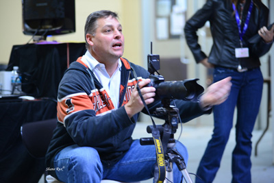
“In any business, promotion is essential,” said Shane Rux, a Florida-based photographer, “High quality images are a must for any stud owner trying to promote their business.”
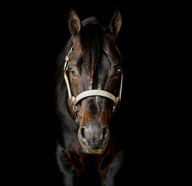
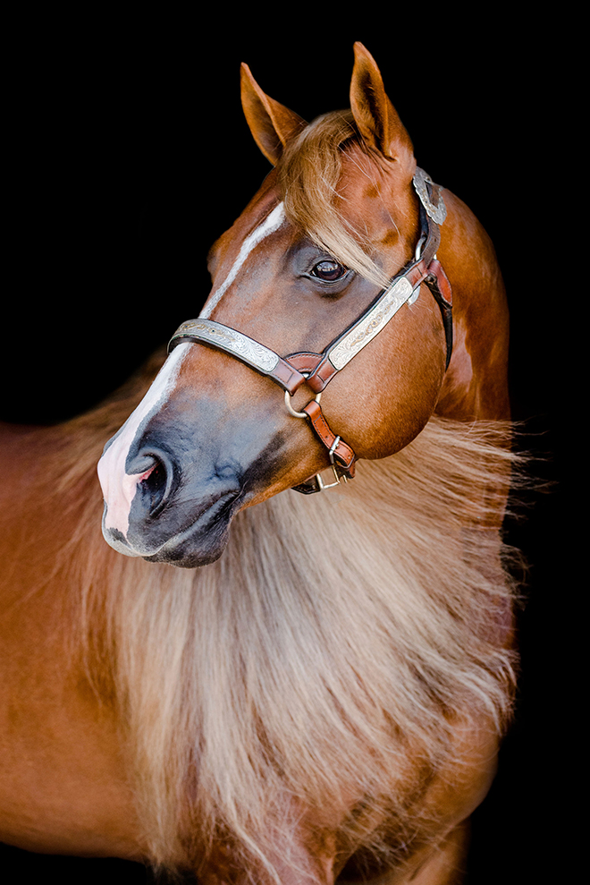
Photos are the anchor in any ad. A great photo captures the essence of a horse and portrays it with one look. It’s hard to put into words the quality of a horse’s movement in a paragraph, but a photograph sums up the stallion’s most desirable traits in a lasting visual.
“Have a professional and take tons of photos when your horse is at their prime,” Nunes said. “There’s nothing worse from a design perspective than only having a win photo to work with.”
As reader’s attention spans get shorter, it is increasingly important to “show, not tell” through advertising. People process visual messages faster than text and are more likely to remember a compelling graphic than text. Jones, Nunes and Rux share their advice on how you can make the most of an investment in a professional photo shoot for your stallion.
Save the cell phone for selfies
High quality photos are an investment. An on-farm portrait session easily costs $1,500 or more. Resist cutting corners with cell phone photos. Cell phone cameras are great for taking selfies or candid moments and the quality of these cameras has dramatically improved. But they are incapable of capturing a great horse image.
“We have all seen horse pictures taken on a phone where the horse’s head seems so much larger and is disproportionate from its body,” Rux said. “It’s because the cell phones are not equipped with focal length.”

Professionals strategically chose lenses that retains a horse’s natural proportions. Lenses are described by their focal lengths. This isn’t an actual measurement of a lens size. It’s a calculation of the point where light forms an image on the camera’s internal sensor. The focal length determines the angle of view being photographed and the size of individual components within the image. Without a focal length, horses end up looking like a giraffe.
“There is a considerable amount of distortion when a horse is photographed with a short focal length lens,” Jones said. “A professional equine photographer will have a lens length long enough to make sure the stallion isn’t distorted, and that the images are flattering to his body type.”
That also makes it difficult to properly photograph a horse with a DSLR camera and a “kit” lens- or the basic lens that comes with an introductory level camera. Professionals invest thousands into lenses and know how to choose angles that highlight the stallion’s conformational strengths.
High quality digital cameras also create digital files that offer graphic designers greater flexibility in the production process. The designer’s job is to make photos look great in print. Photo paper and magazine paper is different, so it is up designers to make that photographer’s work and your horse look their best. The camera files determine how well a designer can do their job.
“Files from a great digital camera allows us to color correct an image and sharpen it to the best possible outcome,” Nunes said. “A low-quality camera and photo – leaves us less to work with.”
Lackluster ads aren’t vibrant because they haven’t been color-corrected. The muscles of a halter horse are lost in murky coloring and shadows. Or the horse himself doesn’t look crisp and sharp. Starting with high-quality files helps ensure a final ad that brings in sales.
It’s show time
A photo shoot is not a competitive event, but you should prepare your stallion as if it is a show. If your stallion has had time off, plan the photo shoot far enough in the future so you have time to get him fit, Rux said. Leading up to the big day, groom your horse as if he were about to be judged.
“They should be ready to impress,” Jones said.
Bathing and grooming are just a starting point. Look at the spot where you think you’d like your stallion to stand. Thinking about what may show up in the background. Fence rails, buildings, equipment and other “stuff” in the background detracts from the subject of the photo.

“Make sure the grass is mowed and there aren’t distractions in the background,” Rux said.
When Rux arrives on site for a shoot, he chooses a location based on the sun, the terrain and the background. Typically, photographers want the sun to their backs. Since a camera lens is designed to capture the light’s rays, the time of day impacts the quality of the photo. If you’ve ever wondered why photographers schedule shoots early in the morning or later in the afternoon, it’s because the softer light creates more dramatic affects.
Think about the last time you had a picture taken on a bright, sunny day. Chances are you were squinting your eyes because mid-day light is harsh. Plus, all the extra light removes some of the details that are picked up in less harsh light. It doesn’t mean a photographer won’t or can’t shoot at other times of the day, chances are they’ll ask for an area with some shade or wait for cloud cover to diffuse the sunlight.
Once Rux finds a space that will work for lighting, he considers the terrain and space available. The more distance he can put between himself and the stallion enables him to capture the horse in the correct proportions. And he avoids having a horse stand downhill, a posture that distorts the horse’s conformation.
“It is also imperative that the stallion is comfortable in the location,” he said. “Make sure he is familiar with the surroundings if you are taking him to a place outside of the ordinary.”
Jones encourages clients to exercise stallions before the shoot so that he doesn’t have excess energy. She also recommends bringing in neighboring pasture horses inside so that an inquisitive stampede doesn’t cause a distraction.
“Make sure he is well fed prior to the session to ensure he is a happy and compliant model,” Jones said.
Getting the perfect “ears up” shot isn’t as simply as setting him up and pressing the shutter. It often takes extra helpers to create the enviable photos that catch people’s attention.
“Extra hands to help always make the session go smoother,” Jones said. “It is helpful if there is one person to handle the stallion, and another to get their attention in the desired location. You also need copious amounts of fly spray.”
The more time you spend preparing for a photo shoot, the more success you’ll have. Photo editing software can sharpen an image but showing the stud “as is” helps people trust your integrity as a breeder, Rux said.
Photo to advertisement
Stunning photographs are worth the investment and they give graphic designers the core material needed to create an ad. Nunes said that crisp photos taken outdoors and those that have minimal shadows are the best starting point.
“Having a lot of photos gives us the chance to let the photo speak for itself,” she said.
The biggest mistake Nunes sees is forgetting to provide (or ask for) vertical images. Advertising is a vertical medium. Unless you’re buying a two-page spread, horizontal photos are too small to make a big impact.
“I often see beautiful images that are horizontal that I pass up – because in an ad they will end up smaller and not come off as well as one that is vertical,” she said.
Beyond photos and the stallion’s name, Nunes needs little else to design the ad, unless the owner has a specific direction they want go. Minimal ad copy also allows the photo, and the horse, to be the center of attention. It should include the important facts, such as winnings, pedigree, any notable genetic traits, the stud fee and contact info. A succinct summary, rather than a full resume, is more likely to draw the reader’s eye.
“A well-designed ad must make the horse the star of the page design should not overwhelm the horse, it should flatter him” she said. “If you notice the horse first and the design second – I think that is a well-designed ad.”
Studies show that people need to see things at least three times or as many as 10 times to be the most memorable. With human behavior in mind, Nunes encourages stallion owners to stick with a single design concept for a minimum of one show season. It can be changed up with new photos, but maintaining a consistent look shows stability and changing it up a bit makes readers not flip right on past, she said.
Powerful promotion
Harness the power of photographs to promote your stallion. One of the best ways to do that is to highlight the stallion’s strongest features.
“Whether that be exceptional movement, flawless conformation, a kind eye, a perfect temperament, etc. The images need to depict the message you want your audience to receive, remember, and associate with your horse,” Nunes said.
Cutting corners is more expensive in the long run than if you’d paid for higher quality photos at the start. Hiring a professional photographer means you’ll end up with images that are in the resolution and format that can be multi-purposed into magazine ads, programs, social media content, your website and much more.


You must be logged in to post a comment Login